What Makes a Good Website?
12 Essential Qualities to Make a Website Stand Out
1. Clear Purpose and Goals
A website with a specified purpose is like a well-organized business; it knows what it wants to achieve and guides users toward that goal. Without a clear purpose, your website can feel aimless, causing users to bounce off quickly.
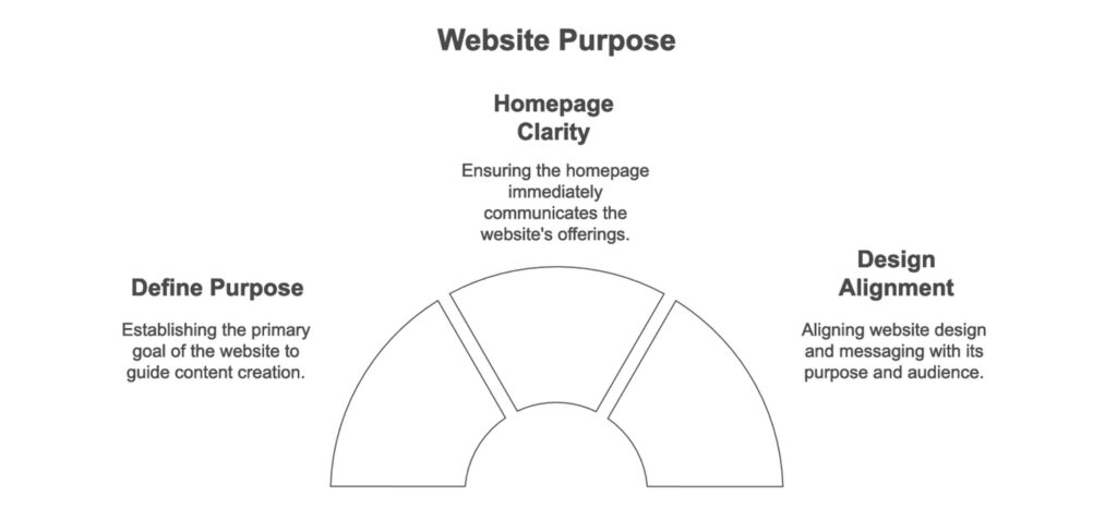
- Define Your Purpose: Is your website primarily to sell products, share information, or build a community? Start by defining this primary goal and use it as a compass for every page you create.
- Clarify the Purpose on Your Homepage: The homepage should communicate what your website offers immediately. For example, an online store might include a tagline like, “Quality Outdoor Gear for Adventurers” to communicate its purpose clearly.
- Align Design with Purpose: If you’re a non-profit, incorporate messaging that encourages donations or support; if you’re a SaaS company, showcase the benefits of your service.
2. Well-Designed and Functional Interface
A visually appealing website grabs users’ attention, but a functional website keeps them engaged. Good design is about creating a balance where aesthetics serve the function and don’t overshadow usability.
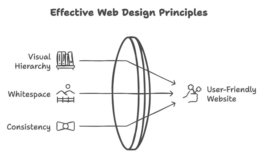
- Emphasize Visual Hierarchy: Structure pages so that important elements, like headlines, CTAs, and key messages, are prominent. Use font sizes, colors, and positioning to guide users’ eyes to these points.
- Whitespace is Your Friend: Whitespace improves readability and allows content to breathe. Avoid cramming too many elements together, as it can overwhelm users and make information harder to digest.
- Consistency Across Pages: Users should feel that they’re navigating within the same space, no matter which page they’re on. For instance, keep navigation menus, colors, and typography styles uniform across all pages.
3. Easy Navigation
Navigation can be seen as the “skeleton” of your website. A clear and intuitive navigation structure helps users find what they need without frustration, boosting both user satisfaction and engagement.
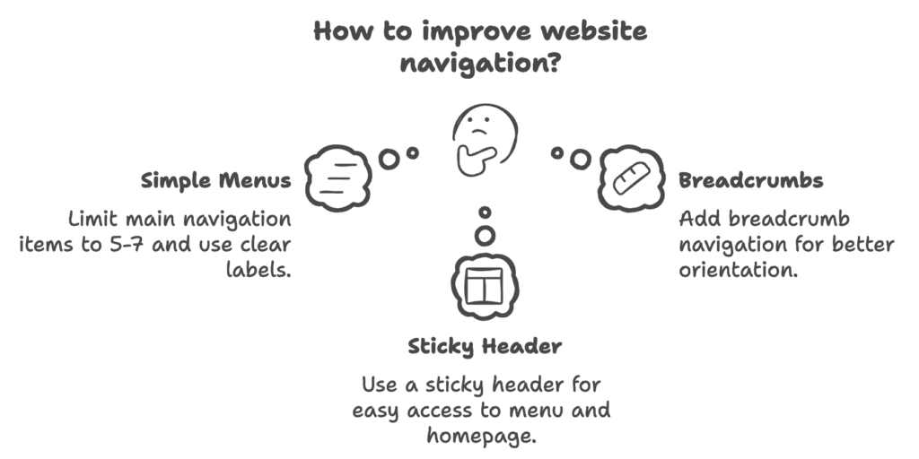
- Keep Menus Simple and Descriptive: Limit the main navigation to five to seven items, and label them clearly to reflect the page’s content (e.g., “Services” instead of vague labels like “What We Do”).
- Breadcrumbs for Orientation: Adding breadcrumb navigation helps users understand their location within the website hierarchy, especially on content-rich or e-commerce sites.
- Use a Sticky Header: A sticky (or fixed) header ensures that users can access the main menu and return to the homepage without scrolling. This can improve user experience on long pages, especially for mobile users.
4. Optimized for Mobile Devices
With the increase in mobile browsing, a website that’s not optimized for mobile is likely to lose a significant portion of its visitors. A responsive design adjusts the website layout dynamically for different screen sizes.
- Implement a Mobile-First Design: Design your site for mobile screens first, then adjust for desktops. This approach ensures that essential elements are functional on smaller screens.
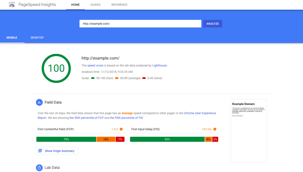
- Prioritize Load Time on Mobile: Mobile users often browse on slower connections. Compress images, use lightweight code, and minimize redirects to ensure faster load times on mobile.
- Consider Thumb-Friendly Design: Position important elements, like buttons, in easily reachable spots to accommodate thumb navigation. Avoid small touchpoints to minimize accidental clicks.
5. Fast Loading Speed
Page speed is a key factor in user retention and satisfaction, directly affecting SEO rankings as well.
- Use Content Delivery Networks (CDNs): CDNs distribute your content across various servers worldwide, reducing load times for users by serving files from a server closest to their location.
- Minimize HTTP Requests: Each image, script, and stylesheet makes an HTTP request, increasing load time. Combine files where possible, and eliminate unnecessary elements.
- Lazy Loading for Media: Delay loading images or videos until they’re in view, a practice called lazy loading. This reduces the initial load time and enhances user experience on longer pages.
6. High-Quality, Fresh Content
High-quality content builds trust and authority, while regularly updated content keeps users coming back and signals to search engines that your site is active.
- Create Evergreen Content: Evergreen content remains relevant over time, like guides, tutorials, or FAQs. These can be optimized regularly to stay up-to-date, ensuring they continue to attract traffic.
- Use a Blog for Regular Updates: A blog allows you to publish fresh content regularly, helping your website rank for additional keywords and keeping visitors engaged.
- Add Value with Visuals: Use infographics, images, and videos to make content more engaging and memorable. Visual content also has the added benefit of being highly shareable, which can increase your website’s reach.
- SEM Copy Optimisation: is important if you want to rank your content high in search engines and get a great ROI on PPC ads.
7. Clear Calls to Action (CTAs)
CTAs encourage users to take specific actions on your site, whether it’s signing up, purchasing, or contacting you.
- Action-Oriented Language: Use strong verbs that make users feel like they’re gaining something. Phrasing like “Download Your Free Guide” is more compelling than “Click Here.”
- Test CTA Placement and Colors: Placement and color of CTAs can affect conversion rates. A/B testing these elements helps you identify which combinations work best.
- Limit CTAs to One Primary Action per Page: Overloading users with too many CTAs can be overwhelming and dilute the effectiveness. Each page should have a main CTA and, if necessary, a secondary option that doesn’t compete for attention.

8. Readily Accessible Contact Information
Contact information not only builds trust but also facilitates conversions by making it easy for visitors to connect with you.
- Include Contact Info in the Header or Footer: Many users instinctively look at the top or bottom of a page for contact details. Making this information accessible across all pages improves usability.
- Create a Detailed Contact Page: A dedicated contact page can include all relevant information like phone numbers, emails, office hours, and even a map for physical locations.
- Consider Live Chat or Chatbots: If customer interaction is essential, a live chat or chatbot provides immediate responses, improving customer satisfaction and reducing bounce rates.
9. SEO-Friendly Structure
SEO is critical for driving organic traffic and making your site visible in search engine results. Good SEO practices involve optimizing both on-page elements and the technical structure of your site.
- Use Keyword-Rich Titles and Headers: Titles, meta descriptions, and headers should incorporate your target keywords naturally. For example, using “qualities of a good website” in an H1 or H2 tag can improve relevance.
- Optimize URLs: Use clear, descriptive URLs with keywords that represent the content. Short, keyword-friendly URLs are better for SEO and user experience (e.g., /contact-us instead of /page?id=12345).
- Improve Internal Linking: Internal links connect related content and distribute authority across your site, improving SEO. For example, linking from a product page to a related blog post can increase user engagement.
SEO Tools like ClimbSEO can help you rank your website higher in search engines by giving you the data and insights you need.
10. Security Measures
User data security and website safety are critical in today’s internet environment, where privacy concerns are high and breaches can damage trust.
- Use HTTPS: An SSL certificate is a must for any website. It encrypts user data and signals to visitors and search engines that your site is secure.
- Set Up a Firewall: A website firewall helps prevent unauthorized access by filtering incoming traffic and blocking potential threats, which is particularly important for e-commerce sites.
- Regular Backups: In case of a security breach or crash, regular backups allow you to restore your site quickly and minimize downtime.
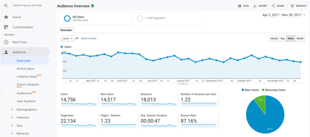
11. Analytics and Continuous Improvement
Analytics provide data on how users interact with your site, helping you refine content, design, and features.
- Monitor User Behavior: Tools like Google Analytics or Hotjar can track how users navigate your site, highlighting popular pages and potential problem areas.
- Focus on Conversion Metrics: In addition to traffic, track conversions, bounce rate, and time on page to assess whether your site is meeting its goals.
- Implement Heatmaps and Session Recordings: Heatmaps and session recordings provide visual insights into user behavior, showing where they click, scroll, and spend the most time, revealing opportunities for optimization.
12. Engaging Visual Content
Visuals are powerful tools for capturing attention and conveying information quickly. They are essential in a world where users often skim content rather than reading in-depth.
- Use High-Resolution Images: Low-quality images can detract from the professionalism of your site. Invest in unique, high-quality images that align with your brand.
- Leverage Video Content: Videos can communicate complex information quickly and keep users on your page longer. For instance, product demo videos can answer questions and improve understanding.
- Optimize for Accessibility: Include alt text for all images, providing descriptions for screen readers and helping with SEO. For video content, include captions for accessibility.
Conclusion
Building a website that truly stands out takes more than just a good design—it requires thoughtful planning, user-centric features, and a solid SEO strategy. By focusing on these 12 qualities, you’re setting the stage for a website that not only engages visitors but also builds trust and delivers results.
If you’re looking to take your website to the next level, Bluehorn Tech can help. We’re passionate about bringing ideas to life, crafting custom solutions that align with your goals and make an impact. Whether it’s creating a brand-new website from scratch or enhancing an existing one, our team has the skills to make it happen.
Ready to start? Reach out to Bluehorn Tech, and let’s discuss how we can help you create a site that reflects your brand, meets your audience’s needs, and supports your business growth.


